Readme#
 gh actions
 pre-commit.ci status
Documentation Status
 Pypi status
 PR welcome
 Black
Black
 License
🔖 Check out the full documentation!
🚧 This is an older project that is currently being brushed up 🚧
Introduction#
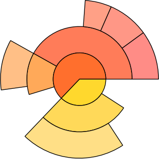
sunburst creates “sunburst charts” (also called “Ring Charts”, “Hierarchical Pie Chargs” or “Multilevel Pie Charts”) together with the matplotlib package.
Quoting Wikipedia:
A ring chart, also known as a sunburst chart or a multilevel pie chart, is used to visualize hierarchical data, depicted by concentric circles. The circle in the centre represents the root node, with the hierarchy moving outward from the center. A segment of the inner circle bears a hierarchical relationship to those segments of the outer circle which lie within the angular sweep of the parent segment.
A prominent example are disk usage charts (see
examples/disk_usage_plot.py for this example):

✨ Features#
sunburst tries to be
Intuitive & Easy to use: After setting up your data and
matplotlib, not more than two lines are necessary to generate first plots (minimal example).Flexible & Robust: Wherever it makes sense, the methods of the
SunburstPlotclass are intended to be overwritten. Methods that are responsible for spacing, coloring, styling etc. of thewedgestake the corresponding data point (path) as an argument, allowing to set most properties independently for eachwedge.
More specifically:
📦 Installation#
To install, run
pip3 install sunburst
🚧 Migration notice#
For more information about recent changes, see the changelog.
The 2.0 version will have a different API without the
PathclassBefore the first release to pypi, this package was called
hpie.There have since bean many non-backwards compatible changes to the API: Most importantly, the
HPieclass is nowSunburstPlotand the package is calledsunburstTo get the old version back, check out the
old-hpiebranch. It will however not be maintained any longer.
🔥 Minimal example#
You can find several examples at examples/. The most basic example is
minimal_example_sunburst.py:
import matplotlib.pyplot as plt
from sunburst import SunburstPlot, stringvalues_to_pv

data = stringvalues_to_pv({
    'ipsum':                      40.45,
    'ipsum/eirmod':               29.34,
    'ipsum/eirmod/dolor':         94.4,
    'lorem':                      36.12,
    'lorem/sadipscing/dolor':     44.32,
    'lorem/sadipscing/lorem':     37.15,
    'lorem/sadipscing/nonumy':    23.98,
    'lorem/eirmod':               11.12,
    'lorem/eirmod/lorem':         45.65,
    'lorem/sadipscing':           79.67,
})


fig, ax = plt.subplots()
sbp = SunburstPlot(data, ax)
sbp.plot(setup_axes=True)
ax.set_title('Example SunburstPlot')

plt.show()
Running this script with python3 minimal_example_sunburst.py will
produce the following plot:

The Data#
Note that the value corresponding to path is always the value
excluding the values of the children of the path. Therefore plotting
the SunburstPlot object computes a “completed” version of the
“pathvalue dictionary”. You can check this with the
SunburstPlot._completed_pv instance variable which gets initialized
after calling SunburstPlot.plot(*args). Running our minimal example
prints the following:
sbp._completed_pv.items() = {
    Path((, )): 442.2,  # = the total sum of all items =
                        # = 36.12 + 44.32 + 37.15 + 23.98 + ...
    Path(('ipsum', )): 164.19000000000003,  # = sum of "ipsum" and all of its children =
                                            # = 40.45 + 29.34 + 94.4
    Path(('ipsum', 'eirmod', )): 123.74000000000001, # = sum of ipsum/eirmod and all of its children =
                                                     # = 29.34 + 94.4
    Path(('ipsum', 'eirmod', 'dolor', )): 94.4,
    Path(('lorem', )): 278.01,
    Path(('lorem', 'eirmod', )): 56.769999999999996,
    Path(('lorem', 'eirmod', 'lorem', )): 45.65,
    Path(('lorem', 'sadipscing', )): 185.12,
    Path(('lorem', 'sadipscing', 'dolor', )): 44.32,
    Path(('lorem', 'sadipscing', 'lorem', )): 37.15,
    Path(('lorem', 'sadipscing', 'nonumy', )): 23.98,
}
sunburst/tests/test_calc.py contains an explicit test of this
calculation based on a similar example.
Ring Charts#
Thus you get ring charts, if and only if all of the non-zero values correspond to paths with the same length. E.g. if we change the above data as follows (by lengthening the paths with question marks and removing the entry for the empty path):
data = stringvalues_to_pv({
    'ipsum/?/?':                 40.45,
    'ipsum/eirmod/?':            29.34,
    'ipsum/eirmod/dolor':        94.4,
    'lorem/?/?':                 36.12,
    'lorem/sadipscing/dolor':    44.32,
    'lorem/sadipscing/lorem':    37.15,
    'lorem/sadipscing/nonumy':   23.98,
    'lorem/eirmod/?':            11.12,
    'lorem/eirmod/lorem':        45.65,
    'lorem/sadipscing/?':        79.67,
})
we should get a classical ring chart. This is
minimal_example_rings.py. Running it via
python3 minimal_example_rings.py yields the following plot, which
indeed just fills up the white space of the above plot with wedges
labeled ?.

License#
This project is licensed under the BSD 3-Clause License, see
LICENSE.txt.